For my university project, I was tasked with implementing type into a spatial environment. I chose to explore the Botanic Gardens and responded to the brief by creating a series of plant markers. I took inspiration from the history of the botanic gardens, specifically kibble palace, with its roots in Victorian Britain.
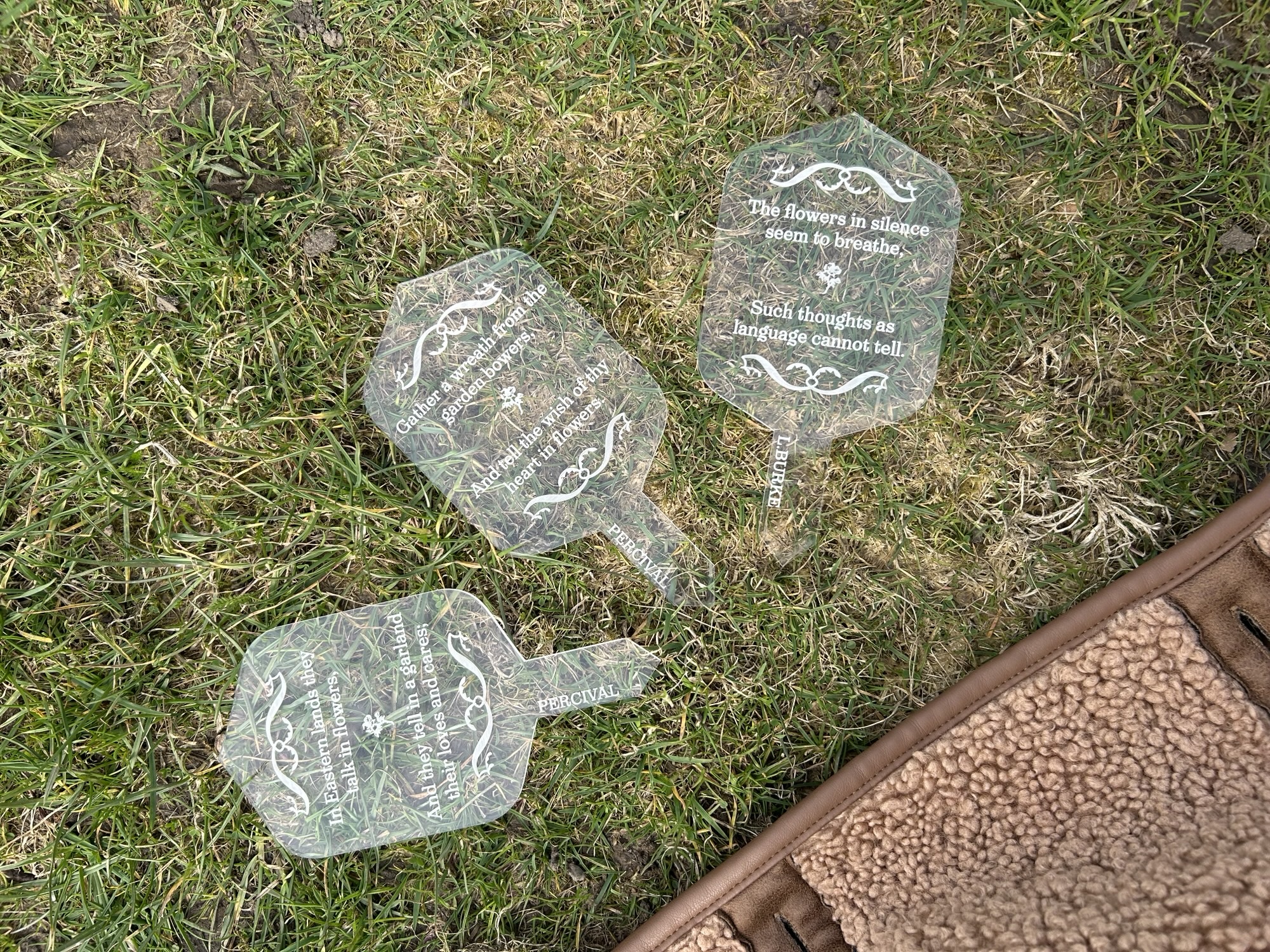
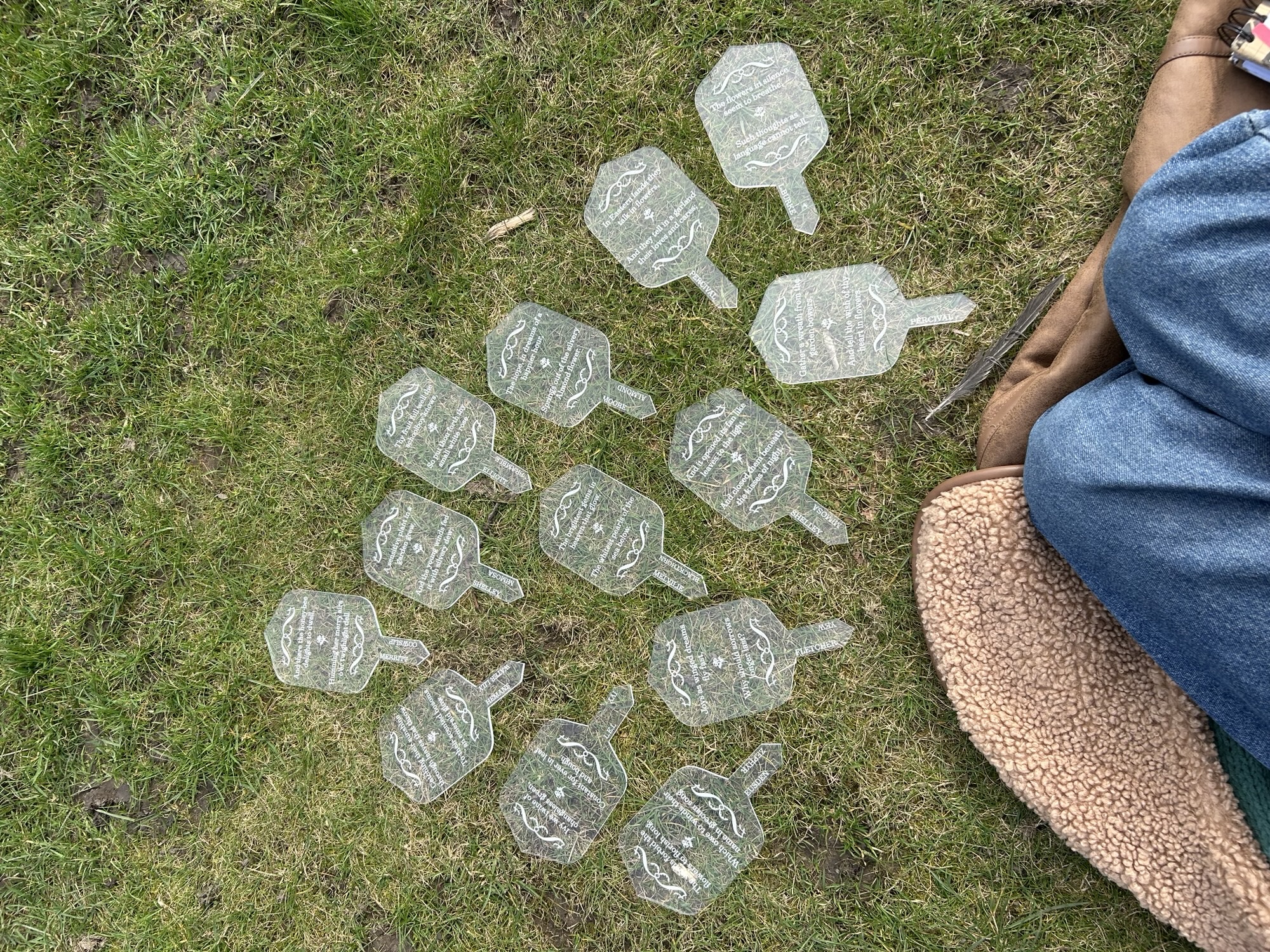
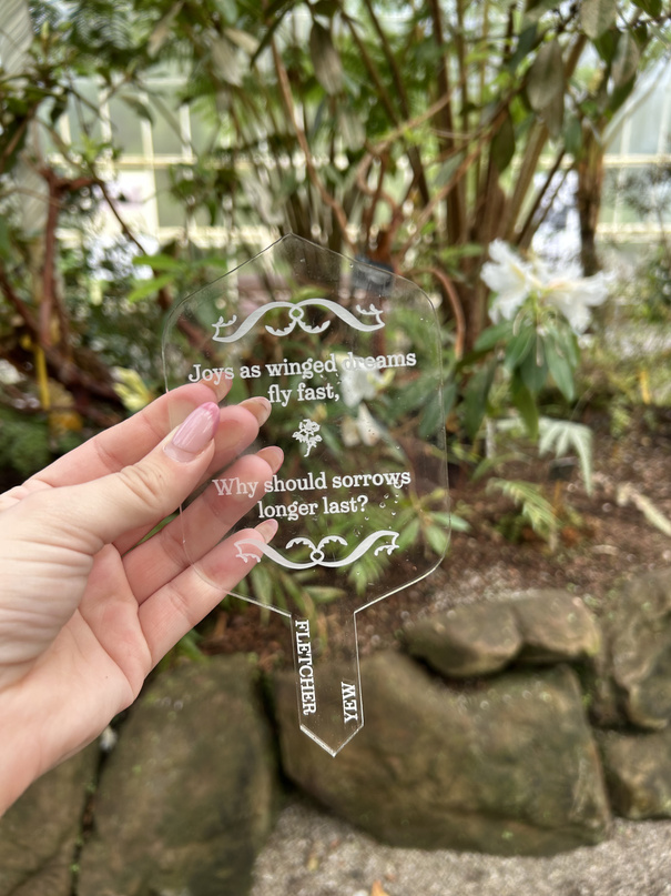
I looked into the origin of the glasshouse, which led me to the Victorian’s love for flowers, and subsequently, floriography, the study of flowers and their meanings. I thought that this was a very interesting subject to explore through the design itself, with its natural connection to words and therefore type. Taking quotes from various books on the flowers, selecting the quotes that I felt had the most connection to the flowers in modern terms, I put them onto plant markers to be scattered around kibble palace.
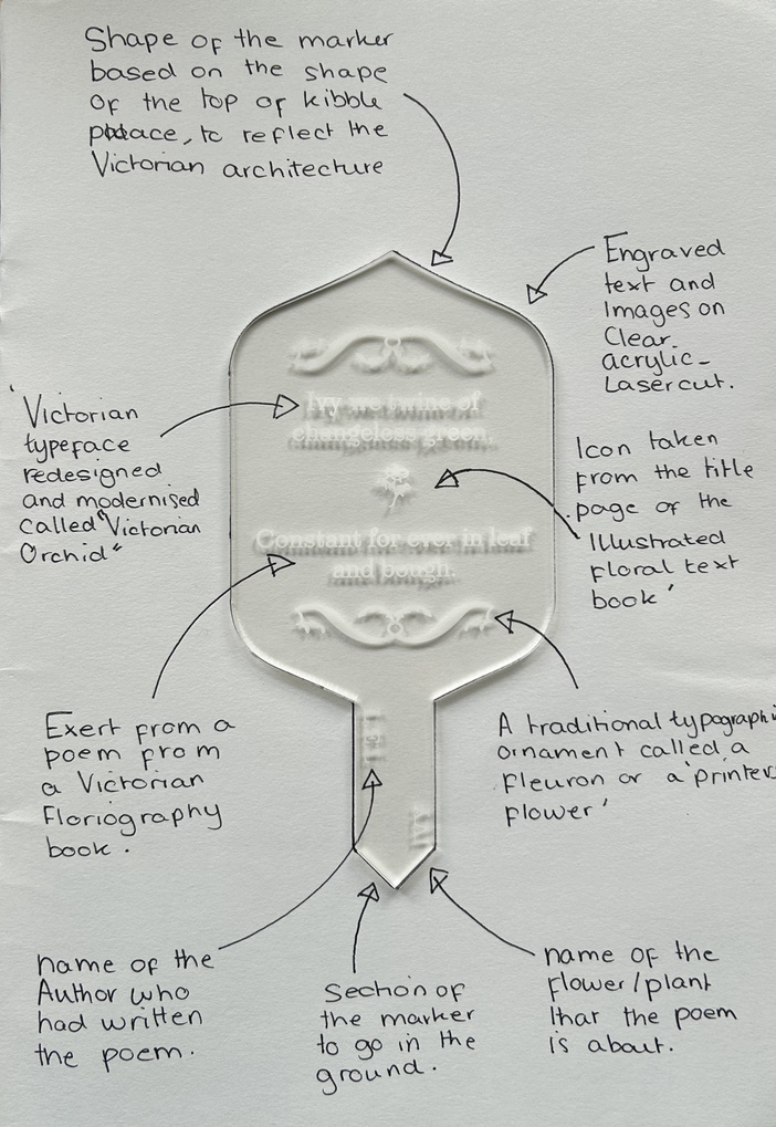
The typeface I used is Victoria Orchid. I chose this, not only because the name fit my theme perfectly, but because it has some floral and organic decorations befitting to the gardens setting but is not too decorative or bold to obscure the clarity of the text. It is a modern typeface heavily inspired by the Victorian era, clearly evident in its bizarre serifs on the letter “a” and other diagonal letter-forms coming from the decorative
types and lettering of the Victorian style.
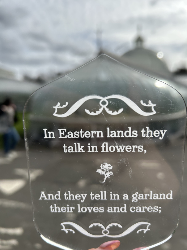
To design the shape of the flower marker, I used the shapes I found in kibble palace to create the main structure. I then typeset extracts of poems from Victorian floriography books and finally finished the marker with a printers ornament (or printers flower) to bring the theme together. I also added the authors name and flower they had written about to the bottom of the marker to give credit and clarity if the marker was removed from the ground, whilst ensuring this did not take away from the words of the poetry.